
Before & After at MB Chic City Condo
Feature Image: Chic City Condo, Megan Baker Interiors
Even the most chic of homes can start as a surprising before photo. As a launching pad for homeowners who followed sunshine with the seasons, this city condo had never had the attention it needed to make it feel like a home. Welcome 2020, and suddenly travel time was forced time at home to realize what needed to be done. That’s when I got the call to give this city condo its ultra chic upgrade.

THE WISH LIST
What was on our design brief? A combination of major upgrades and minor tweaks resulting in a complete renovation and furniture package to turn the homeowners space into a house that improves its function and suits their impeccable personal style:
- Solve traffic flow
- Go bold with furniture style
- Add function and display equally
- Highlight an art collection rich in family stories

BEFORE : the existing space on measuring day

AFTER : Renovations, furniture and styling complete for the photoshoot
STYLE & SPACE PLANNING
Determining the overall aesthetic of the home came easily out of conversations about a warm feel, black & white colour palette and anything and everything that would add personality opposite that of a typical Vancouver condo development. More ideal would be a dreamy apartment you might stay in on your travels between Paris and New York City. A concept was born, and it was all the foundation my team and I needed to take this condo into a new decade (and new city– conceptually anyways!)

BEFORE : Furniture for a different home didn’t work in the space
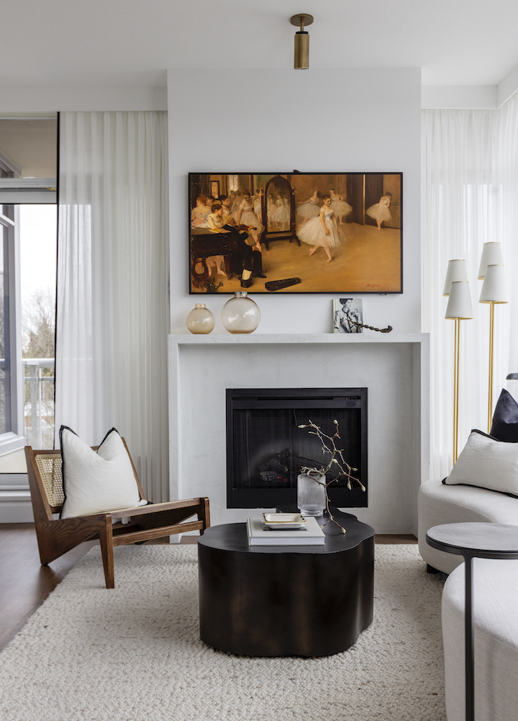
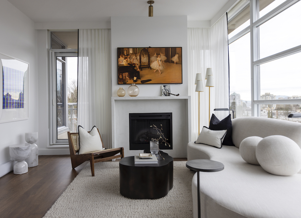
AFTER : The right scale turns this fireplace into a focal point
FUNCTION & FURNITURE
Furniture placement was the biggest fix to traffic flow problems in the space. A common issue when downsizing is bringing in furniture from a larger home, and ending up with a crowded feel and nowhere to move around a new smaller space. I moved the dining zone right up to the wall with a new custom banquette to give as much space as possible to the living room. Re-orienting the sofa opened up movement from one side of the open concept to the other, and allows for better cocktail party conversation.

BEFORE : Awkward storage a few too many pieces of furniture for the space

AFTER : A custom dining bench opened up the space
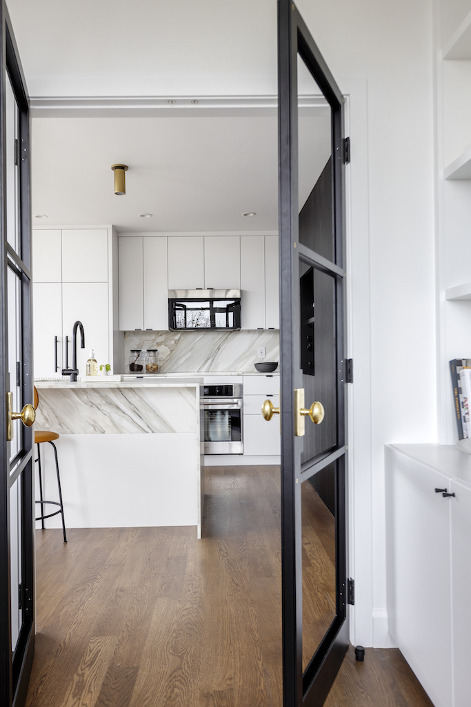
KITCHEN ILLUSIONS
This kitchen was dying to break free of its one wall design! I knew I needed to take over the wall that had a small pantry, and make it a bigger part of the form and function of the kitchen. What was once a mix and match of drywall, glass cabinets and unused wine cubbies is now a huge focal point for the whole space. Because we clad the entire wall in black stained oak, it becomes a feature of the living room, kitchen, and even the font entry where this paneling wraps around! Streamlining materials is so important in a small space because it takes away visual clutter and makes it feel grand. Using that same principle, a whole new set of appliances were chosen so everything could be built in and covered with cabinet doors. We also applied just one (stunning!) stone for both the countertops and backsplash to elevate the whole space.

BEFORE : Lots of materials and bulky appliances overwhelm the space

AFTER : A black feature wall is the focus

BEFORE : oversized hardware takes up visual space
AFTER : a fresh palette and beautiful natural stone countertops
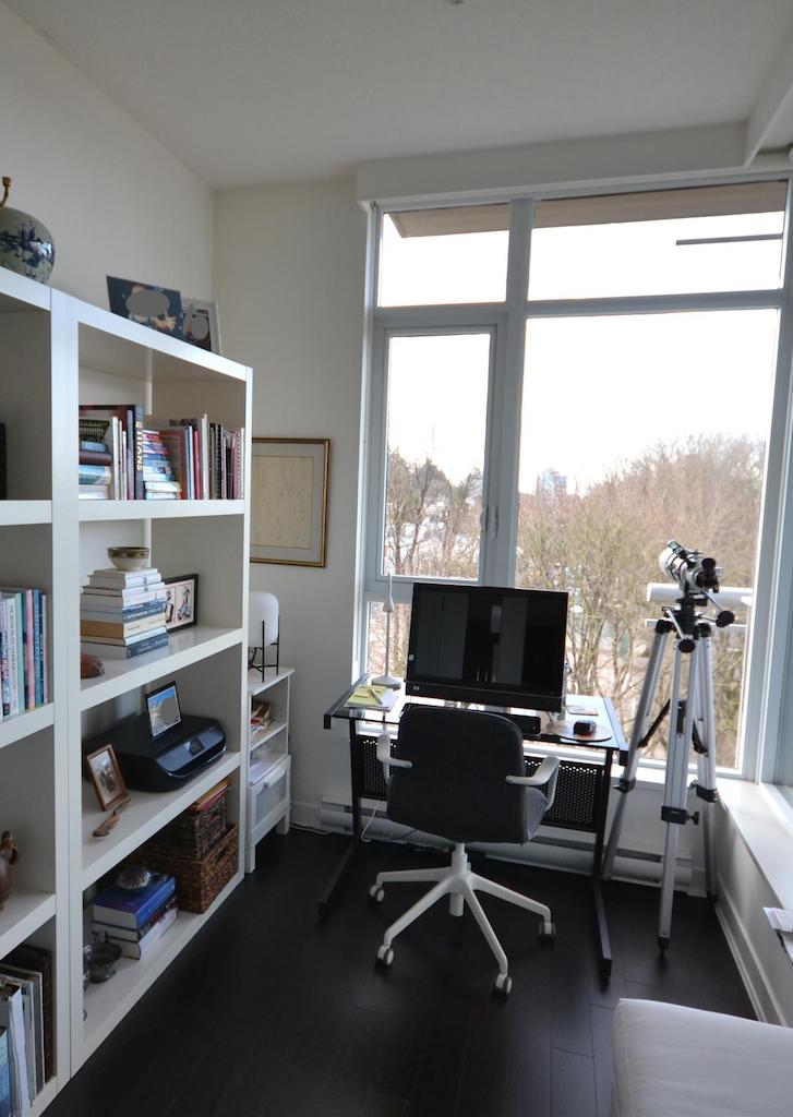
WORK FROM HOME
Visible from the kitchen and entry, the office in this home is a perfect case study for the value of custom built-ins (we call it millwork in the industry). The existing furniture was working hard, but could not take advantage of every inch of space available wall-to-wall and floor to ceiling. Designing a custom solution to hide functional stored items below, and showcase personal travel collections above was the only way to make sure this office not only looked great, but worked perfectly for the homeowners.
BEFORE : Purchased furniture doesn’t fit the space

AFTER : Custom millwork stores and displays
There’s nothing better than welcoming clients back home after a complete renovation! It’s a fresh start in a location that has already feels like home. Now, this Chic City Condo has spaces that flow elegantly from one room to the next , and furniture with a timeless cool factor. Not only did we meet our design brief, but also the timeline and budget with $25 to spare! There are a few more rooms that finish this home, but I’ll leave them or another post. For the complete virtual tour, take a look at the Chic City Condo portfolio here. If you’re inspired to start your own dream home project, get in touch so we can turn your ideas into a reality as beautiful as this one.
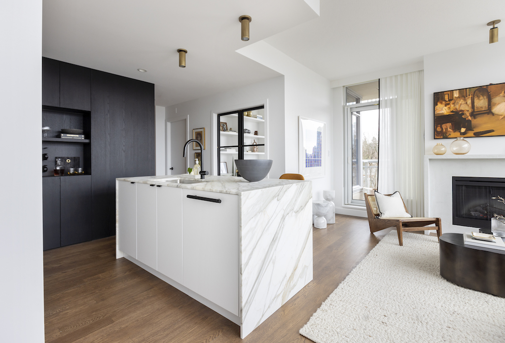
AFTER : view from the dining area
Special thank you to some of our favourite colleagues and suppliers for being a part of this project:
Construction – Headland Construction
Photography – Janis Nicolay
Stone – SSC Countertops
Cabinetry – Sofo Kitchens
Hardware – Schoolhouse Electric
Furniture & Lighting – CF Interiors
Appliances – Midland Appliance
Plumbing – Robinson Lighting and Bath


[…] beautiful bed at my Chic City Condo project layered up for the […]